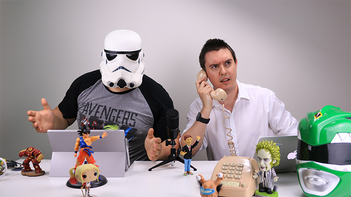
Animated titles for another gaming podcast on YouTube & Twitch.

- 01. Another Nerdy Podcast
- 02. BobbleHedz
- 03. Loadshift
- 04. Origami Email Series
- 05. Rezillia
- 06. Blarg! News
- 07. English Unlimited College
- 08. Thomson Reuters
- 09. Dan & Mitch
Loadshift
A heavy haulage transport marketplace that can move anything not bolted down. Designed completely in-browser, I aimed to provide an intuitive and pragmatic visual overhaul for users new to the mobile web.
Origami Email Newsletter Series
A young tech startup were approaching a full product rebrand. During the interim they wanted to spruce up email communication, so they commissioned a series of funky little templates to capture the essense of their brand whilst keeping it essentially white label.
Coding everything I design ensures nothing gets lost in translation.

I was contracted to redesign an aged college website using a small collection of physical marketing flyers for reference.
The site was designed in-browser, allowing for regular client interaction during the development process.


Thomson Reuters Mobility Project
In 2014 Thomson Reuters were ramping up their mobile efforts to remain competitive. Back then many places were still rocking kludgy unresponsive design with slow mobile performance. They brought me in to help adapt their websites and products.

An interiors graduate wanted an online presence to stand out to recruiters. The goal was to tailor a personable brand using strong typography, handmade assets and thoughtful curation.

 $25
$25
Mal Winter
and the
Cloud Runners
A nifty marketing website designed to promote a kids' book series with illustrations by the author himself.
The site was designed in-browser, utilising depth and parallax effects to bring dimension to the colourful character drawings.
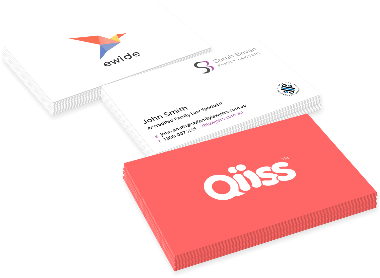
Branding and
Business Stationery
A various collection of logo designs, branding docs and anecdotes from previous gigs ranging from law firms, web agencies and one peculiar dating network... I know right.


